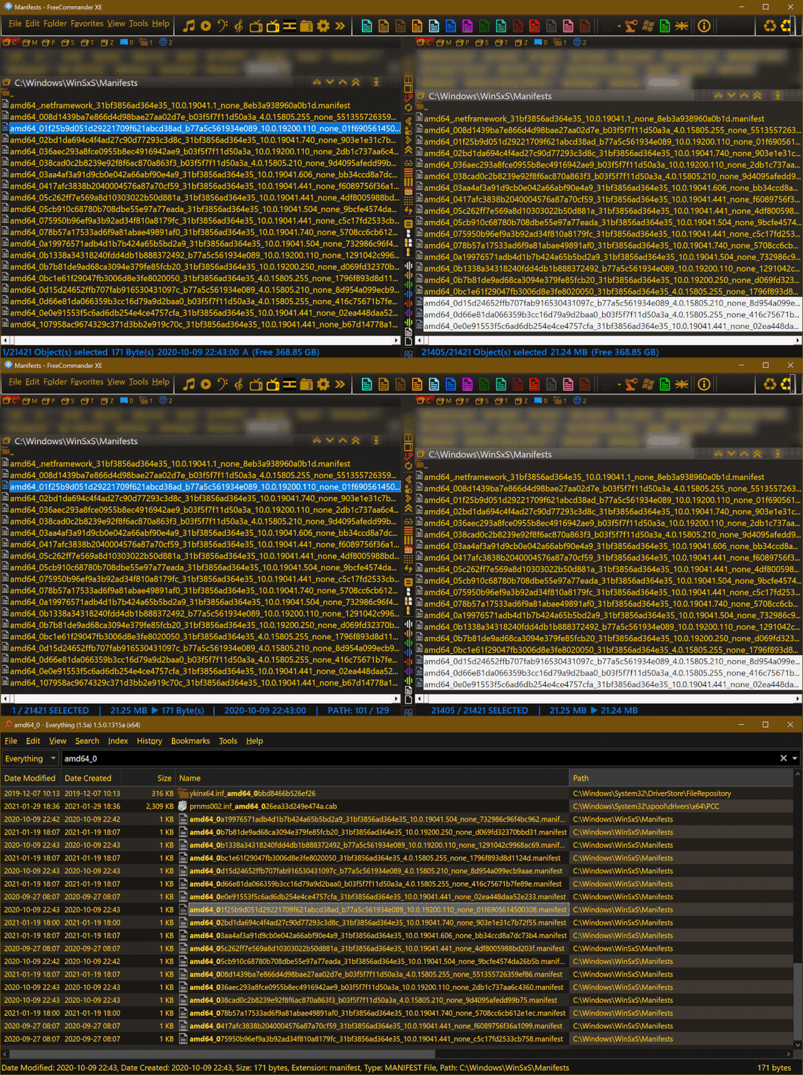
Here is an animated presentation showcasing comparison between data display in the bottom bar of: FreeCommander with default settings vs. FreeCommander with user adjusted settings vs. Everything

In the left panel of FreeCommander the selected file is the same as in Everything. In the right panel of FreeCommander the selection includes almost every file in its folder - thus the difference of also number of elements presented in the bar [aside from values]
As you can see, in regards to how and what data is displayed, the amount of control which FreeCommander gives to its users is profound [although it has some limitations and glitches]. But in Everything users are regrettably unable to e.g. get rid of repetitions of data [like dates already displayed in columns], change font to uppercase [to soothe problems with impaired vision of a user] or replace long names / descriptions with shorter denotations [to save horizontal space thus make all the data still visible on smaller monitors]